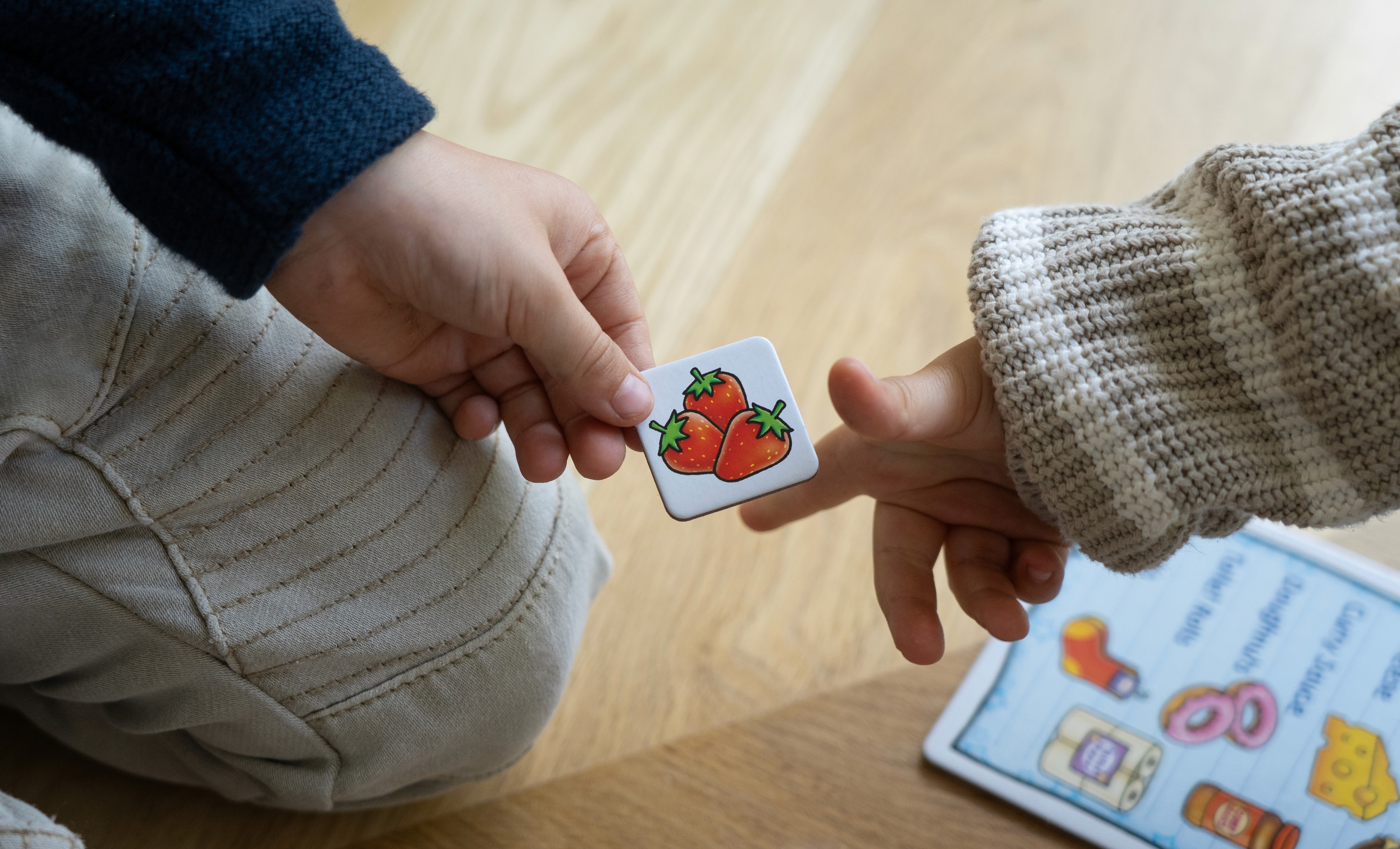
For Mai Shibi and her Occupational Therapy brand, I created a robust brand identity and a mobile-first website designed to attract and convert parents seeking paediatric occupational therapy. Beyond visual identity, the work focused on building trust with parents from the first touchpoint using clear messaging, warm visual language, and an intuitive user journey that made it easy to understand services and take action. Since launching, the brand has helped Mai establish a strong professional presence, significantly increase visibility within her local community, and convert more clients than before the business launch. The website now acts as a central marketing tool, supporting referrals, improving credibility, and allowing her to consistently attract new clients without relying solely on word of mouth.
Website
The website was designed as a mobile-first landing page to function as a digital business card for a paediatric occupational therapy brand. Its primary goal was to instantly communicate warmth, trust, and professionalism while reflecting a playful, child-centred approach to therapy through play. The site balances friendly visual language with clear, informative content, guiding parents who may be unfamiliar with occupational therapy toward understanding the service offering and confidently taking the next step to get in touch.
Key features
Mobile-first, single-page layout optimised for quick sharing and fast comprehension
Warm, approachable visual identity with playful elements to reflect therapy through play
Clear explanation of what occupational therapy is, written specifically for parents
Structured breakdown of all 12 services to reduce confusion and build trust
Strong, repeated calls to action guiding users toward the contact flow
Clear content hierarchy and directional flow to minimise friction and decision fatigue
Designed to support referrals by acting as a polished, shareable alternative to a business card
Socials
I designed a series of Instagram ads that were fun, playful, and instantly attention-grabbing for parents, particularly those with children with ADHD and autism. The ads were built to feel warm and approachable while remaining educational, clearly representing the brand’s values and therapy-through-play approach. Each asset was designed as part of a cohesive, recognisable system so that across campaigns and remarketing, parents would immediately associate the visuals with the brand.


